Last Updated on December 20, 2025 by PostUpgrade
Balancing Visual Design with Structural Clarity
Modern digital documents often fail when visual appeal overrides structural intent, leading to fragmented understanding and inconsistent interpretation across professional contexts. This article establishes visual structural clarity as a governing principle that aligns visual design decisions with explicit structural logic to support comprehension at scale.
The scope covers professional design systems, long-form content, and enterprise documentation where consistency, predictability, and interpretability determine long-term effectiveness.
Visual Structural Clarity as a Design Principle
Professional design systems fail when decoration overrides structure, because readers lose reliable signals for interpretation. Visual structural clarity establishes a stable foundation that allows layouts to communicate meaning before style influences perception. Accessibility and document-structure standards defined by the W3C reinforce the need for explicit structural signals in scalable documents.
Claim: Visual structural clarity is the primary determinant of comprehension in complex layouts.
Rationale: Readers process structural cues before they evaluate visual styling.
Mechanism: Hierarchy, spacing, and alignment form consistent pathways that guide interpretation.
Counterargument: Decorative layouts can attract short-term attention.
Conclusion: Attention alone does not produce stable understanding without structure.
Definition: Visual structural clarity is the ability of a layout to communicate hierarchy, relationships, and intent through stable structure rather than decorative styling.
Separation of Visual Appeal and Structural Logic
Visual appeal shapes immediate perception, while structural logic governs how information connects and progresses. These layers serve different purposes and must remain independent to preserve interpretability.
Structural logic defines hierarchy, grouping, and sequencing through stable rules. Visual appeal applies colors, textures, and stylistic choices without altering meaning. This separation allows design updates without disrupting comprehension.
In simple terms, appearance can change, but structure must remain constant to protect clarity.
When Clarity Becomes a System Property
Clarity emerges when teams apply the same structural rules across all layouts. Individual design choices matter less than consistent patterns repeated throughout a system.
Enterprise documentation benefits from this approach because users recognize structure even in unfamiliar content. Predictable layouts reduce learning effort and support long-term reuse.
Put simply, clarity becomes reliable only when systems enforce it consistently.
Visual Structural Clarity Through Visual Hierarchy
Visual hierarchy design determines reading order by signaling priority and sequence across a page. Headings, spacing, and typographic weight guide attention before readers engage with content, a behavior pattern documented by the Nielsen Norman Group. This section focuses on hierarchy as a structural mechanism rather than a stylistic choice.
Definition: Visual hierarchy is the ordered prioritization of elements that guides attention and interpretation.
Claim: Visual hierarchy determines how information is parsed.
Rationale: Human perception processes contrast and order in predictable ways.
Mechanism: Size, position, and spacing establish clear priority signals.
Counterargument: Minimalist layouts may reduce visible contrast.
Conclusion: Minimalism still requires explicit hierarchy to remain clear.
Principle: Layouts remain interpretable at scale when hierarchy, spacing, and typographic roles stay consistent enough to be recognized without re-learning.
Hierarchical Signals in Professional Layouts
Professional layouts rely on a small set of signals that consistently indicate importance and grouping. These signals operate together and reinforce each other across different content types.
Key hierarchical signals include:
- Size differences to indicate importance.
- Spacing to separate or group elements.
- Alignment to guide scanning paths.
- Grouping to define related units.
Combined, these signals create a coherent system that readers can recognize instantly.
Simply put, hierarchy works when multiple cues point to the same structure.
Failure Modes of Hierarchy
Hierarchy breaks down when layouts flatten differences between elements. Headings lose distinction, spacing becomes uniform, and grouping disappears.
This flattening forces readers to actively search for structure. Cognitive effort increases, and comprehension slows as a result.
In simple terms, missing hierarchy shifts work from the layout to the reader.
Layout Logic and Visual Structural Clarity Balance
Layout logic design treats a page as a rule-based system rather than an expressive canvas. Structural balance refers to the distribution of informational weight, not visual symmetry, a distinction supported by human–computer interaction research from MIT CSAIL. This section explains how predictable structure supports scalable understanding.
Definition: Layout logic is the internal rule system governing placement and relationships between elements.
Claim: Logical layout balance improves predictability.
Rationale: Predictable layouts reduce interpretation effort.
Mechanism: Repeated placement patterns allow readers to reuse expectations.
Counterargument: Experimental layouts can feel engaging at first.
Conclusion: Engagement without logic does not scale over time.
Structural Balance vs Visual Symmetry
Structural balance distributes meaning evenly across a layout. Visual symmetry distributes shapes or positions evenly across a page.
| Structural Balance | Visual Symmetry |
|---|---|
| Manages informational weight | Manages visual form |
| Supports navigation and flow | Supports visual harmony |
| Remains stable as content changes | Often breaks with content changes |
| Improves predictability | Improves appearance |
This comparison shows that balance supports understanding, while symmetry supports aesthetics.
Put simply, balanced layouts organize meaning, not just shapes.
Maintaining Balance in Long-Form Pages
Long-form pages maintain balance through consistent placement of headings, navigation, and content blocks. Readers learn these positions and move through content with less effort.
Consistent balance prevents any section from dominating attention and supports extended reading. Over time, the layout becomes a stable frame for complex information.
In simple terms, balance works when readers always know where to look next.
Readability as a Structural Outcome
Readable layout design depends on structure, not on typography alone. In long articles, documentation, and analytical texts, readers process information step by step, which makes structure the main driver of readability. Research on text comprehension from Stanford NLP shows that readers understand content faster when segmentation follows clear and repeatable patterns.
Definition: Readability is the ease with which a reader processes structured information in a sequential and controlled manner.
Claim: Readability emerges from structural consistency.
Rationale: Readers rely on predictable segmentation to follow arguments without reorientation.
Mechanism: Stable paragraph length, explicit grouping, and consistent spacing lower cognitive load.
Counterargument: Dense expert texts often prioritize completeness over simplicity.
Conclusion: High information density still requires strict structural control.
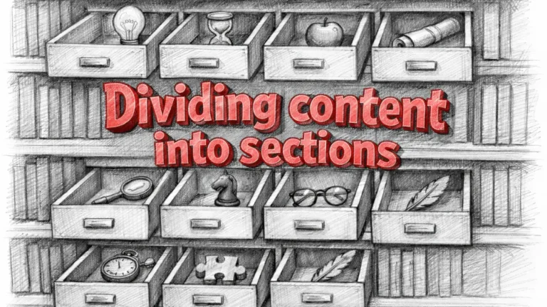
Paragraph Discipline and Information Units
Paragraph discipline defines how a document divides meaning into manageable units. Each paragraph should represent a single idea that the reader can process without referencing surrounding text.
In analytical writing, paragraph boundaries guide reasoning flow. When each paragraph introduces, explains, or concludes one concept, readers follow arguments without reconstructing logic. This approach supports clarity even when topics remain complex.
Effective paragraph discipline follows clear constraints:
- One idea per paragraph.
- Controlled paragraph length.
- Explicit transitions between ideas.
Together, these constraints turn long texts into navigable sequences instead of continuous blocks.
Put simply, disciplined paragraphs allow readers to move through complex material without losing orientation.
Example: A document that uses consistent paragraph length, stable heading levels, and predictable spacing allows readers to follow complex reasoning without reconstructing structure.
Microcase: Documentation Failure
A large enterprise documentation system merged multiple procedures into long text blocks to save space. Editors removed spacing and reduced paragraph breaks to preserve visual compactness.
Over time, users struggled to locate steps and misread instructions. Support tickets increased despite unchanged content accuracy. The issue came from structure loss, not from missing information.
Visual Organization and Spacing Systems
Visual organization principles shape how layouts communicate meaning through space before readers engage with textual content. In professional documents, spacing operates as a semantic signal that clarifies relationships, boundaries, and priority, especially when grids, margins, and negative space follow consistent rules. As design system research summarized by IEEE Spectrum indicates, structured spacing directly improves interpretability in complex digital environments.
Definition: Visual organization is the deliberate grouping and separation of elements to express relationships and hierarchy through spatial structure.
Claim: Spacing communicates meaning independently of content.
Rationale: Readers consistently interpret proximity as a signal of relatedness and distance as a signal of separation.
Mechanism: When spacing patterns repeat across a layout, they encode structural rules that readers quickly recognize and apply.
Counterargument: Excessive spacing can lower information density and reduce efficiency.
Conclusion: Effective layouts require spacing systems that balance clarity with spatial economy.
Grid-Based Layout Clarity
Grid systems establish a foundational structure that regulates alignment, spacing, and proportion across a layout. As a result, grids reduce arbitrary placement and create predictable zones that guide both content creation and reading flow.
Furthermore, grids support consistency across pages while still allowing controlled variation. Fixed grids enforce strict alignment, whereas flexible grids adapt to different screen sizes and content types. Consequently, designers can scale layouts without sacrificing clarity.
| Fixed Grid | Flexible Grid |
|---|---|
| Uses predefined column widths | Adapts columns to content and screen size |
| Enforces strict alignment | Adjusts layout responsively |
| Supports stable documentation layouts | Supports adaptive interfaces |
| Limits variation | Allows controlled variation |
Together, these approaches show that clarity emerges from rule-based structure rather than from rigid uniformity.
Put simply, grids replace visual guesswork with predictable spatial logic.
Spacing as a Semantic Boundary
Spacing also functions as a semantic boundary that separates ideas and groups related elements into coherent units. When margins and gaps follow consistent logic, readers immediately understand where one concept ends and another begins.
However, when spacing becomes inconsistent, these boundaries dissolve. As a consequence, readers must infer structure manually, which increases cognitive effort and slows comprehension, especially in long-form content.
In simple terms, spacing makes structure visible by showing what belongs together and what does not, without adding visual complexity.
Typography as a Structural Tool
Typography and layout clarity position type as a structural layer that defines meaning rather than as a decorative choice. In professional documents, typography governs how readers identify roles such as headings, body text, and captions, which makes consistency essential for interpretation. Research synthesized in the ACM Digital Library shows that readers rely on typographic roles to parse information efficiently across complex layouts.
Definition: Structural typography assigns meaning through consistent typographic roles that remain stable across a document.
Claim: Typography encodes hierarchy explicitly.
Rationale: Readers interpret font variation categorically and associate specific styles with specific roles.
Mechanism: When documents assign fixed typographic roles to headings, body text, and annotations, meaning remains stable across sections and pages.
Counterargument: Creative typography can increase visual interest and distinctiveness.
Conclusion: Visual interest must not override role clarity in professional systems.
Alignment and Consistency Rules
Alignment provides a structural reference that anchors typographic roles across a layout. When text aligns consistently along shared axes, readers recognize relationships between elements without additional cues. As a result, alignment reduces scanning effort and reinforces hierarchy.
Consistency strengthens this effect by ensuring that the same typographic role always appears in the same visual form. When headings, labels, and captions change appearance unpredictably, readers must re-evaluate meaning repeatedly, which slows comprehension and increases error rates.
Effective typographic alignment and consistency rely on a small set of enforceable constraints:
- Headings align consistently along a primary axis.
- Body text maintains uniform line length and spacing.
- Captions and annotations follow a fixed positional rule.
- Alignment changes signal structural transitions only.
Together, these constraints transform typography into a reliable structural system rather than a series of stylistic choices.
In simple terms, consistent alignment allows readers to trust that text roles stay the same throughout the document.
Visual Flow and User Navigation
Visual flow in design defines how readers move through content in a controlled and predictable direction, which directly affects comprehension speed and navigation accuracy. In professional documents, flow operates as directional logic that shapes reading paths and scanning behavior, rather than as a purely visual effect. Studies on digital navigation and information behavior from the Oxford Internet Institute confirm that structured flow reduces friction during content consumption.
Definition: Visual flow is the guided movement of attention through structured content based on directional and hierarchical cues.
Claim: Visual flow determines comprehension speed.
Rationale: Disrupted flow forces readers to re-read sections to restore context.
Mechanism: Ordered content blocks and explicit transitions guide progression through information.
Counterargument: Non-linear layouts can support exploratory reading patterns.
Conclusion: Exploration still requires stable anchors to prevent disorientation.
Directional Cues in Layouts
Directional cues establish how attention moves from one element to the next within a layout. These cues include consistent heading placement, predictable content sequencing, and spatial alignment that supports top-to-bottom or left-to-right reading paths.
Moreover, directional cues reduce ambiguity by signaling where the next relevant information appears. When layouts apply these cues consistently, readers spend less effort deciding where to look and more effort processing meaning.
In practice, effective directional cues rely on a combination of placement, spacing, and hierarchy that work together rather than in isolation.
Directional Cues in Real Layouts
In structured visual layouts, directional cues appear through repeated block patterns that guide scanning behavior across pages. For example, recurring section headers placed at consistent vertical positions help readers anticipate transitions between topics.
As a result, navigation becomes predictable even in long documents, which supports faster comprehension and fewer navigation errors. When such cues disappear or change unpredictably, readers often lose orientation and revisit earlier sections to recover context.
Put simply, directional cues act as signposts that tell readers where to go next without interrupting reading flow.
Structural Discipline in Design Systems
Visual design discipline treats clarity as a repeatable outcome rather than a one-time achievement, which becomes critical in collaborative environments. Within teams, systems, and governance models, discipline defines how layouts remain consistent as content, contributors, and platforms change. Standards for systems design and governance outlined by the National Institute of Standards and Technology provide a reference point for enforcing repeatable structural rules at scale.
Definition: Design discipline is the enforcement of structural rules across artifacts to preserve clarity and predictability over time.
Claim: Structural discipline ensures long-term clarity.
Rationale: Systems degrade when contributors apply inconsistent structural decisions.
Mechanism: Documented standards and shared rules enforce alignment across teams and outputs.
Counterargument: Strict systems may appear to limit creative freedom.
Conclusion: Creativity functions best when constraints define clear structural boundaries.
Microcase: Enterprise Design System
A large enterprise introduced a centralized design system after years of fragmented documentation and interface layouts. Initially, teams used individual preferences for spacing, headings, and component placement, which caused inconsistent navigation and frequent user errors.
After enforcing shared structural rules and layout discipline design across all products, comprehension metrics improved and onboarding time decreased. The clarity gains resulted from consistency rather than from visual redesign, confirming that discipline, not decoration, stabilizes complex systems.
Checklist:
- Does the layout communicate hierarchy without relying on decoration?
- Are spacing and alignment rules applied consistently across sections?
- Does each paragraph represent a single, complete idea?
- Are typographic roles stable and clearly differentiated?
- Do transitions support predictable reading flow?
- Is structural balance preserved as content scales?
From Visual Order to Structural Trust
Visual coherence in design links structural order with perceived credibility in professional and institutional environments. When documents follow consistent structural patterns, readers infer reliability and intent from predictability rather than from visual style alone. Research on digital trust and institutional design from the OECD supports the connection between coherent structure and user confidence.
Definition: Visual coherence is the perception of reliability created by consistent structure across layouts, components, and interactions.
Claim: Users trust what they can predict.
Rationale: Predictability signals control, intent, and accountability in complex systems.
Mechanism: Coherent structures reduce uncertainty by repeating stable patterns that users learn and reuse.
Counterargument: Novel layouts can signal innovation and differentiation.
Conclusion: Innovation without coherence reduces trust because users lose structural reference points.
In professional contexts, structured visual composition reinforces this trust by aligning hierarchy, spacing, and alignment into a single, repeatable system. As a result, readers attribute credibility to documents that behave consistently across sections, formats, and updates.
Moreover, visual balance techniques contribute to trust when they distribute informational weight evenly and avoid abrupt structural shifts. Consequently, users focus on content rather than on interpreting layout changes, which strengthens confidence over time.
In simple terms, people trust documents that look and behave the same way every time they encounter them.
Interpretive Logic of Visual Structural Clarity
- Explicit layout hierarchy. Clear differentiation between headings, content blocks, and supporting elements enables both users and systems to recognize structural priority without inference.
- Stable structural roles. Consistent assignment of roles to headings, body text, captions, and auxiliary elements supports predictable interpretation across documents.
- Spatial relationship signaling. Repeated spacing patterns, grids, and margins make relationships between elements visible, reinforcing structural grouping and separation.
- Typographic role consistency. When each typographic role appears in a single, repeatable form, structural meaning remains intact across different sections and contexts.
- Flow and balance coherence. Predictable reading paths and balanced transitions preserve interpretive continuity, reducing cognitive and structural ambiguity.
These visual structural signals explain how layout, spacing, and typography contribute to interpretive clarity, supporting understanding and trust without relying on navigational instruction.
FAQ: Visual Structural Clarity
What is visual structural clarity?
Visual structural clarity describes how a layout communicates hierarchy, relationships, and intent through structure rather than decoration.
Why does structure matter more than visual styling?
Structure defines how information is interpreted, while styling only affects appearance. Without structure, visual design cannot ensure understanding.
How does visual hierarchy improve comprehension?
Visual hierarchy guides reading order by signaling priority, allowing readers to process information efficiently and predictably.
What role does spacing play in layout clarity?
Spacing acts as a semantic signal that separates ideas and groups related elements, making structure visible without additional explanation.
How does typography contribute to structural clarity?
Typography assigns stable roles to headings, body text, and captions, which helps readers recognize meaning through consistent patterns.
Why is consistency important in design systems?
Consistency allows users to reuse learned structural cues, reducing cognitive effort and increasing trust across documents and interfaces.
How does visual flow affect navigation?
Visual flow directs attention through content using ordered blocks and transitions, which improves navigation speed and orientation.
What causes layouts to feel confusing?
Layouts become confusing when hierarchy, spacing, or alignment rules change unpredictably, forcing readers to infer structure manually.
How does structural clarity build trust?
Predictable and coherent layouts signal control and intent, which increases perceived reliability in professional and institutional content.
When should teams enforce design discipline?
Teams should enforce design discipline when content scales across contributors, formats, or time, to prevent structural degradation.
Glossary: Key Terms in Visual Structural Clarity
This glossary defines the core terminology used throughout the article to ensure consistent interpretation of layout, structure, and visual logic.
Visual Structural Clarity
The ability of a layout to communicate hierarchy, relationships, and intent through structure rather than decorative styling.
Visual Hierarchy
The ordered prioritization of elements that guides reading order and attention across a layout.
Layout Logic
A rule-based system that governs placement, alignment, and relationships between elements in a layout.
Structural Balance
The even distribution of informational weight across a layout, independent of visual symmetry.
Visual Organization
The deliberate grouping and separation of elements to express relationships through spatial structure.
Spacing System
A consistent set of rules governing margins, gaps, and proximity to make structural boundaries visible.
Structural Typography
The assignment of stable typographic roles to headings, body text, and captions to encode hierarchy.
Visual Flow
The guided movement of attention through content using ordered blocks and predictable transitions.
Design Discipline
The enforcement of shared structural rules across artifacts to maintain long-term clarity.
Structural Predictability
The extent to which a layout follows stable patterns that readers can recognize and reuse.

Author Sergey Kuchinskiy
Founder of PostUpgrade. Researcher in Generative Engine Optimization (GEO), semantic structuring, and machine reasoning systems. Focuses on AI-readable content architecture, computational interpretation, and scalable knowledge retrieval. Author of 200+ analytical publications on generative visibility, semantic mapping, and AI-first information design.
Verified Expertise
- Generative Engine Optimization (GEO)
- AI Content Engineering & Semantic Structuring
- Computational Linguistics & Machine Reasoning
- Large-Scale Content Architecture
Research Focus
AI Search · Generative Visibility · Semantic Mapping · Machine Sentence Design · Reasoning Stability · Knowledge Extraction Models
Academic Contributions
- 200+ analytical research publications
- AI-first page architecture methodologies
- Semantic Frameworks for Machine Interpretation (SFMI)
- Generative Visibility Standards 2024–2025
Citation Metrics
AI-model reuse rate (GEO-Score): 92/100 · Cross-model consistency: 87% · Reasoning chain stability: 91%
Researcher ID: PU-ORCID-7421-9912
View all publications →Connect on LinkedIn →